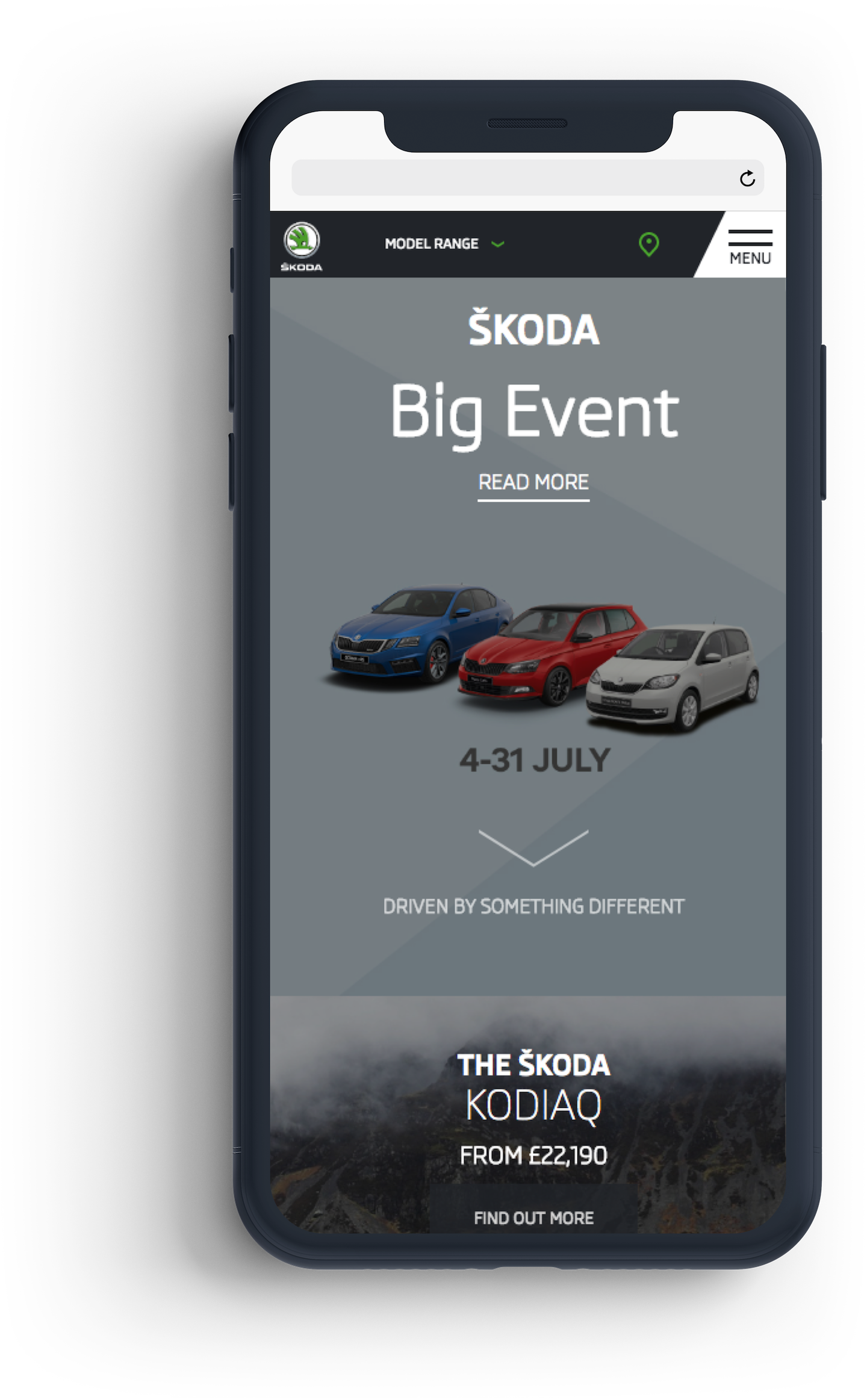
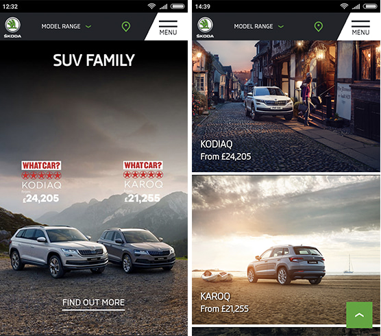
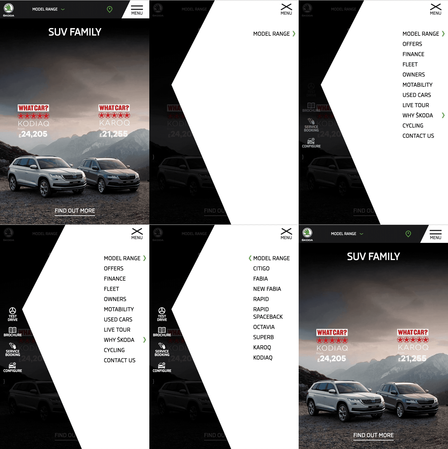
As part of the new branding was the introduction of a crystal shape, used for ŠKODA's image cover pieces and other large materials . Having a dominating shape overlay on images wasn't possible on mobile. Instead, using the crystal as a block colour and background within the menu allowed it to remain front and centre.
ŠKODA
Transforming the mobile experience
Role
DesignerAgency
Reading RoomProject
ŠKODA's mobile site was outdated and miles behind their desktop counterpart - with major inconsistencies
visually and content wise. In 2016, ŠKODA brought in a
new piece of branding with Bradley Wiggins as the face of their initial campaign.
The project was to do a complete re-design and led by the new branding and incorporating their new campaign.
Process
A collaborative process through workshopping, design development and prototyping.
Research and requirements gathering
Through workshopping and activities with the client to understand their needs and goals and collaborating with the branding agency to understand the new brand and approach.
Wireframing and planning the pattern library
Working with the client and internal team to e how it could be improved, reduced and structured and what content types would need to be designed for.
Design experimentation and collaboration
Using the research, wireframes and content types, quick testing out broad ranges of styles and approaches, having open conversations and collaborating with the client and branding agency to establish a route to move forward with.
Design development and prototyping
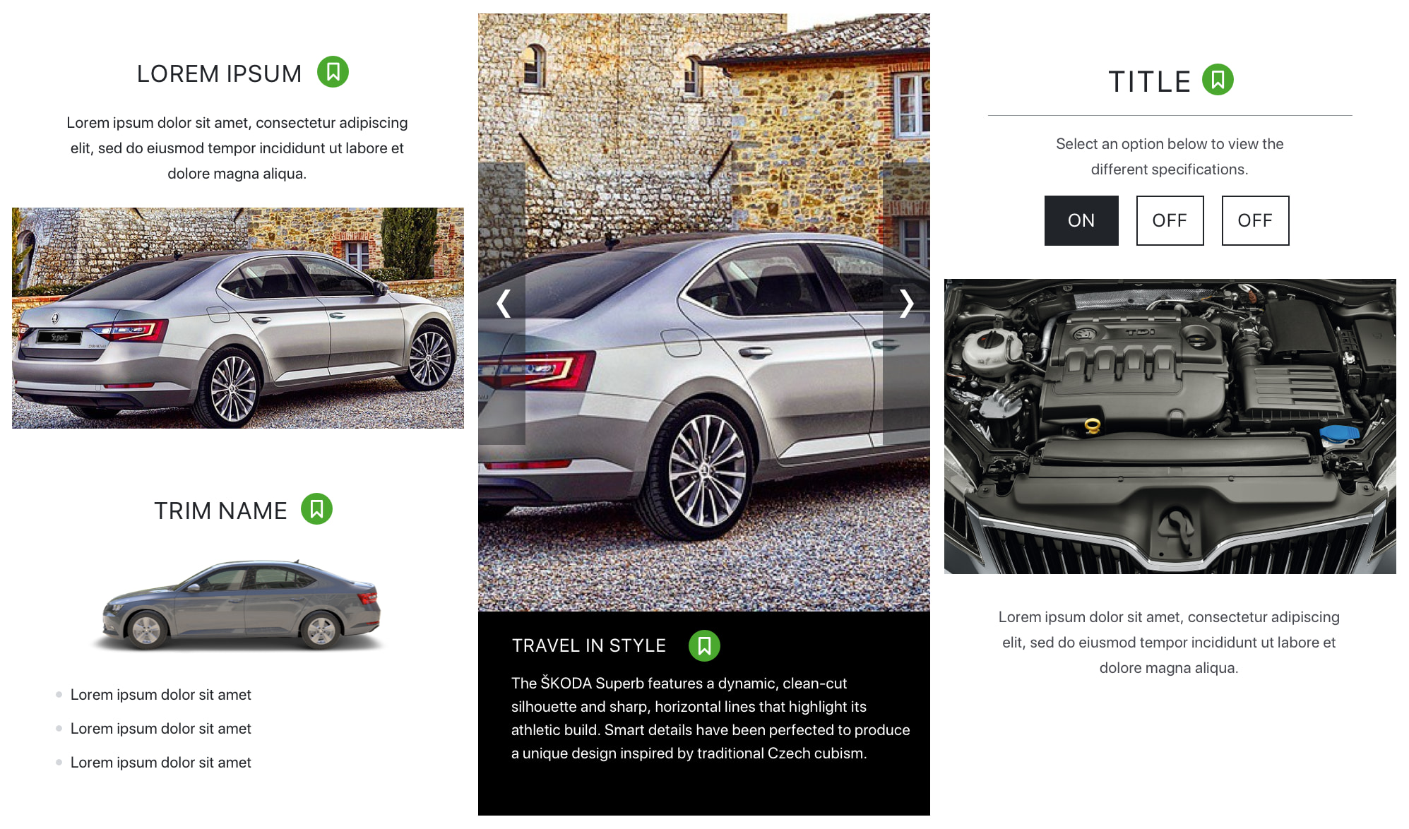
Alongside another designer, finalising the pattern library, using prototypes to demonstrate how real world pages would look when built up with components.
Key features
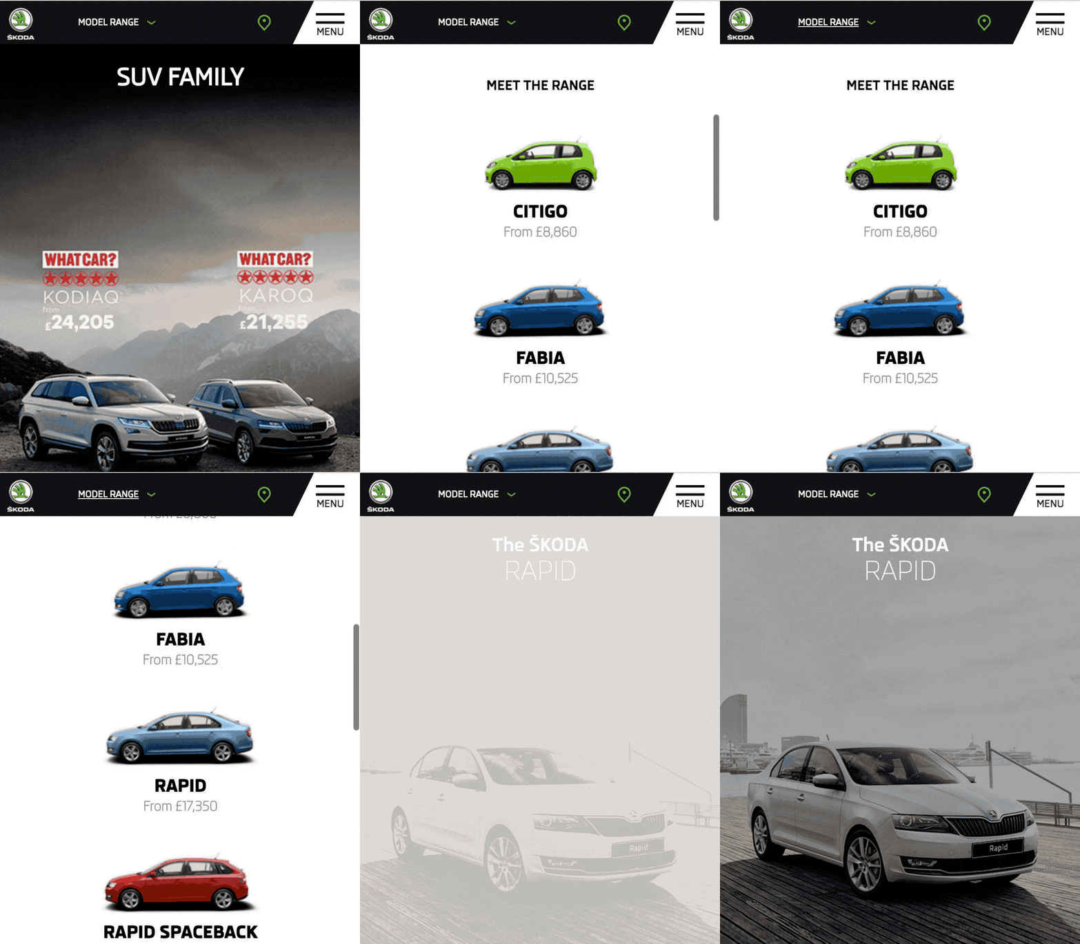
Not all users can put a name to a face when it comes to car models. Introducing a visual car model selector took the guess work out, saving users time in finding the type of car they're looking for.